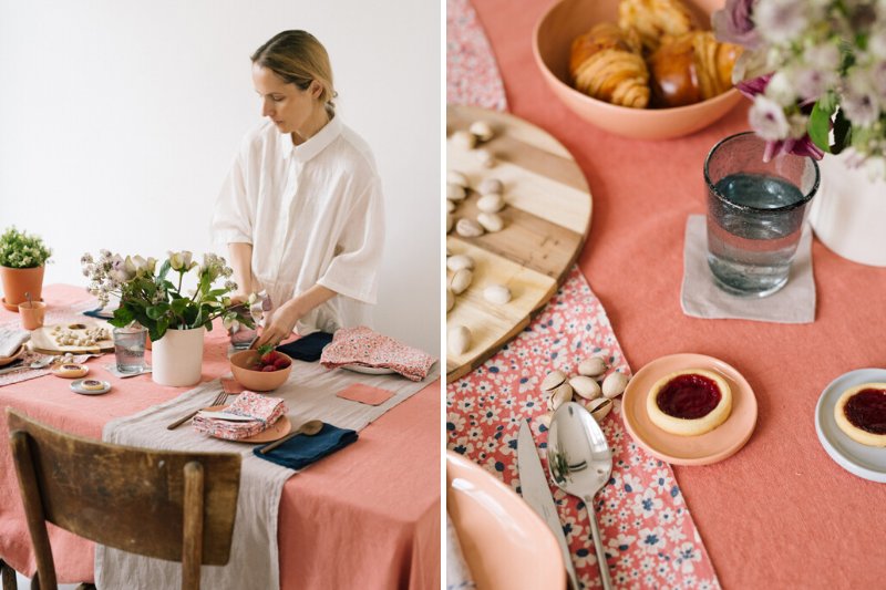
Spring is finally here and like every year, along came our new colors.: brighter Apricot and more neutral Portobello.
It’s official - spring is finally here! We are eager to invite them to our homes and we believe our new colors will be just perfect for this job. This season we are introducing two warm shades and one flora inspired print that will make your home bloom. Color-coordinated, these new additions to our color palette will be easy to style and will create a cheerful and inviting atmosphere.
APRICOT AND PORTOBELLO
As the name may suggest, Apricot is our happy color of the season. Bright and warm, it may be used as an accent in a form of napkins or placemats. Or, if you are going for something more intense, Apricot tablecloth will be a true eye-catcher in your dining room. As color blocking is one of the main interior trends this year, you can complement Apricot with one or two matching colors to create the look.

In photos: Portobello Linen Table Runner + Navy Linen Napkins + Portobello Linen Coasters
Portobello, on the other hand, is a counterweight color that is calm and neutral. It is a warmer and softer alternative for Natural color and goes perfectly with all the nude, blush and peachy shades. When styling your table, use it to counterweight the bright colors by adding Portobello napkins or table runners or make it a perfect background for bright accents by using Portobello tablecloth.

In photo: Portobello Linen Tablecloth + Cafe Creme Linen Table Runners + White Linen Napkins
BLOSSOM PRINT
Last time on our blog we shared with you some of the biggest home interior trends that we are going to see this year. As you may remember, small floral prints are going to be a hit and we are happy to introduce to you our take on these trends. Blossom print is bright, cheerful and has a slightly retro vibe to it. We see it as our already-favorite outdoor picnic tablecloth color. You can easily pair it with bright Apricot or darker Navy colors or use it on its own as a centerpiece.


